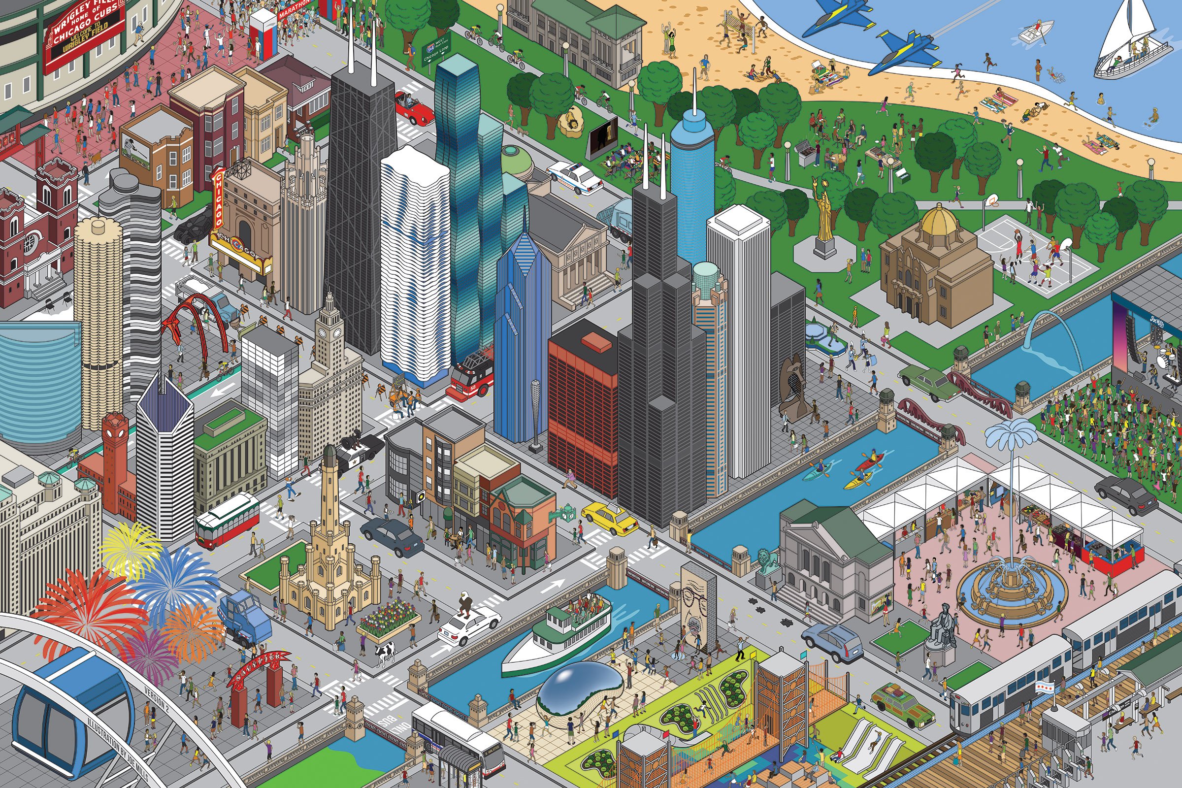
Chicago Complete
The Loop Map
Chicago Compilation
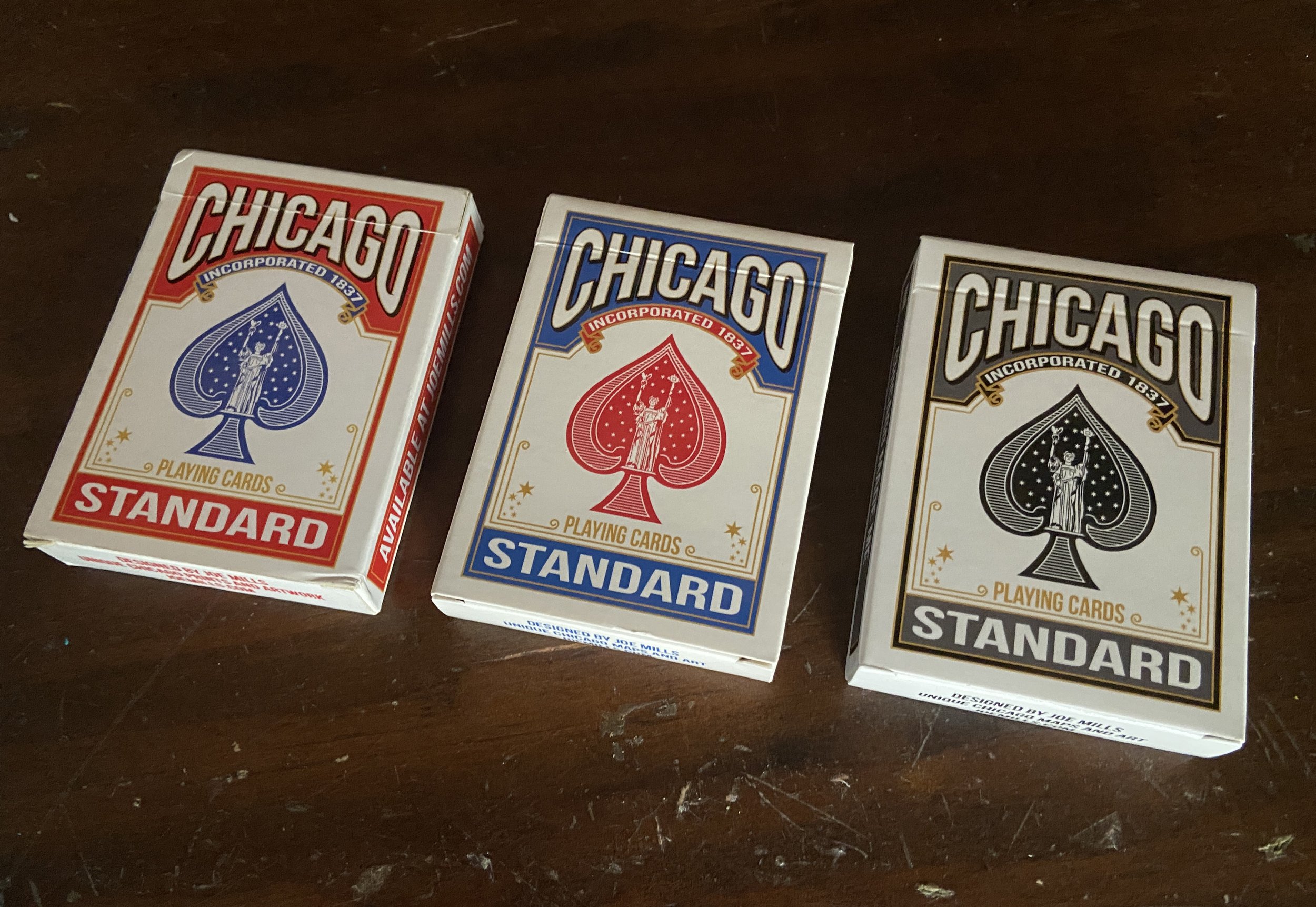
Chicago Playing Cards
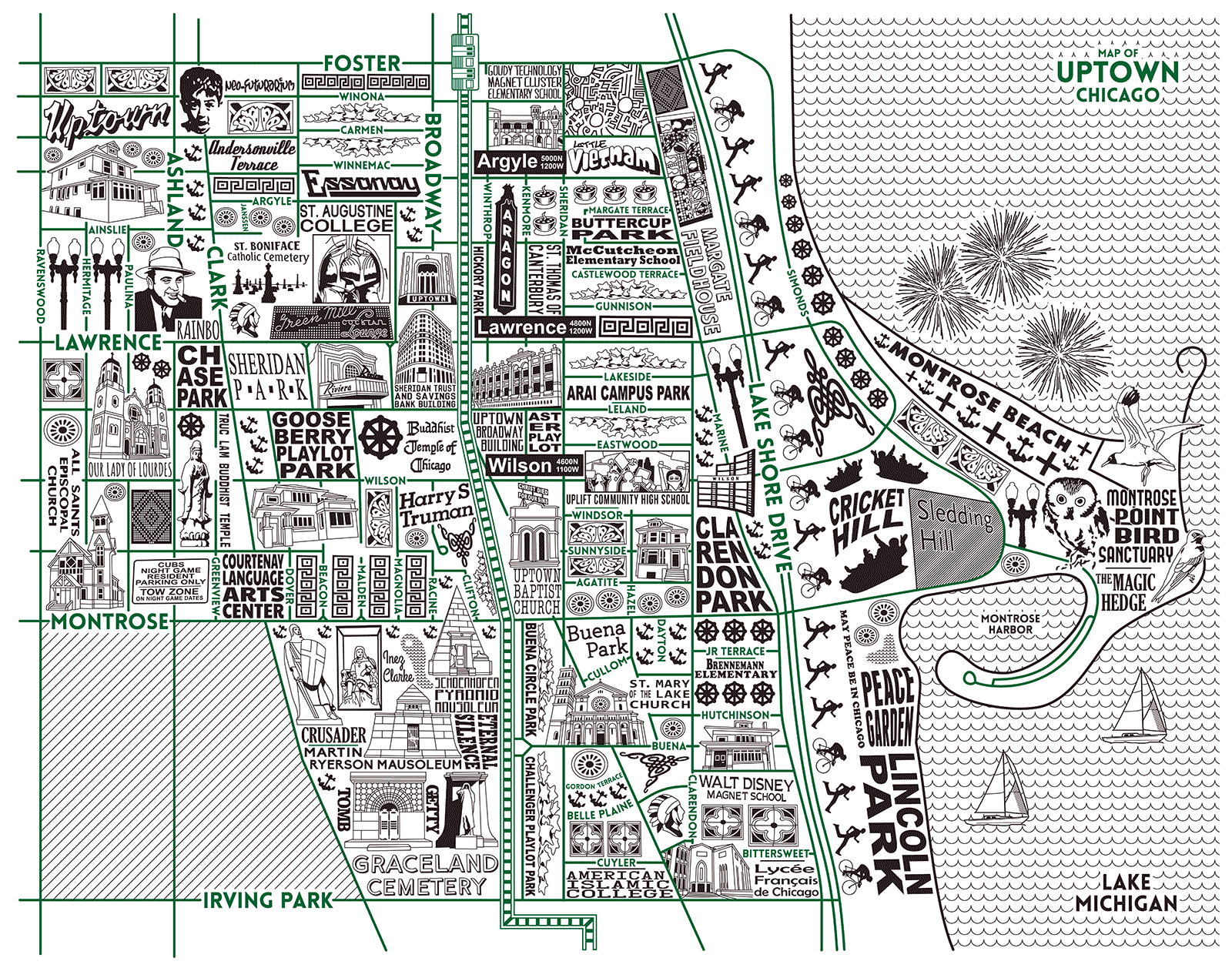
Chicago Neighborhood Maps
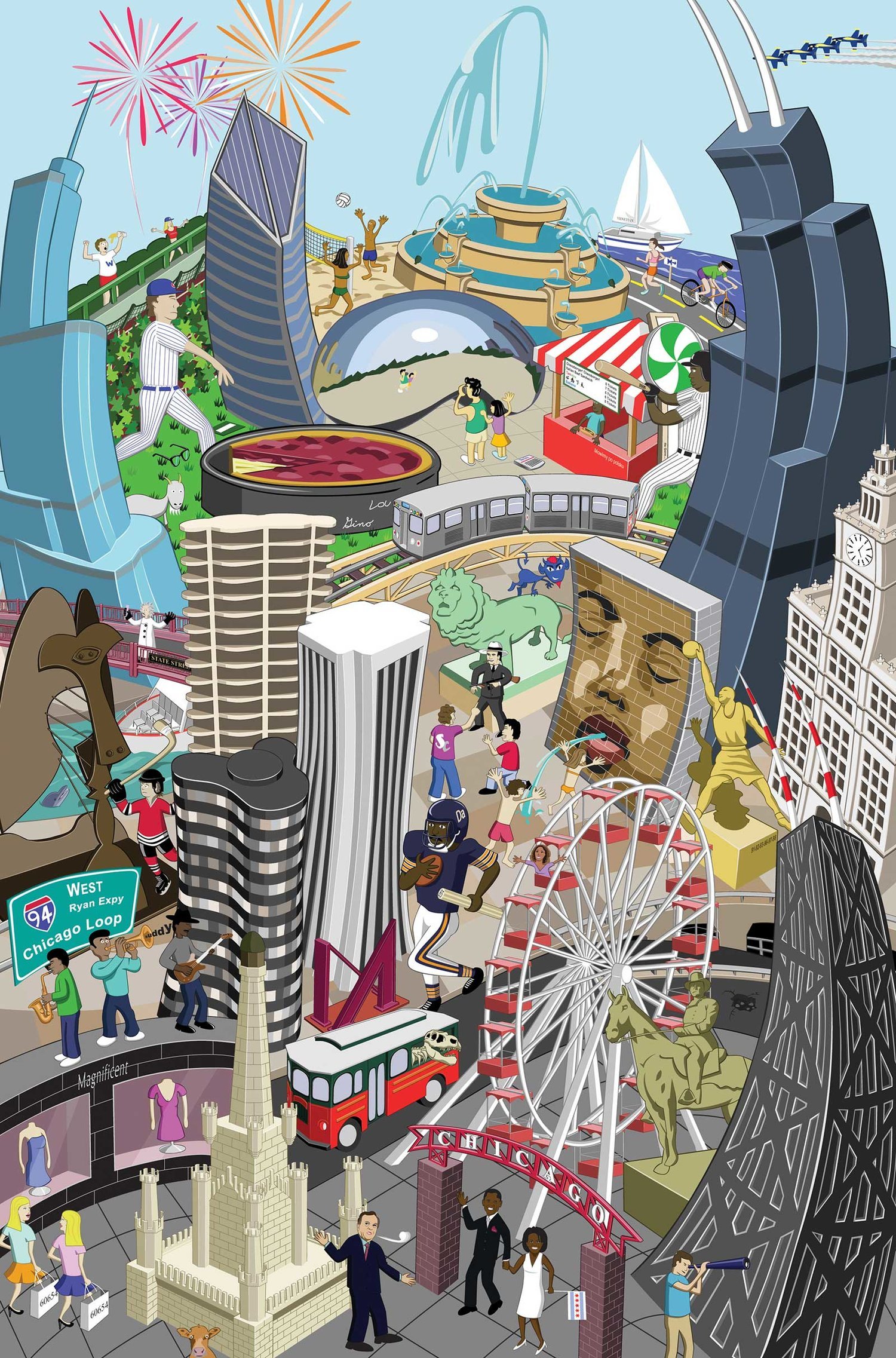
Ultimate Chicago
Flat Chicago
Chicago Factory Animations
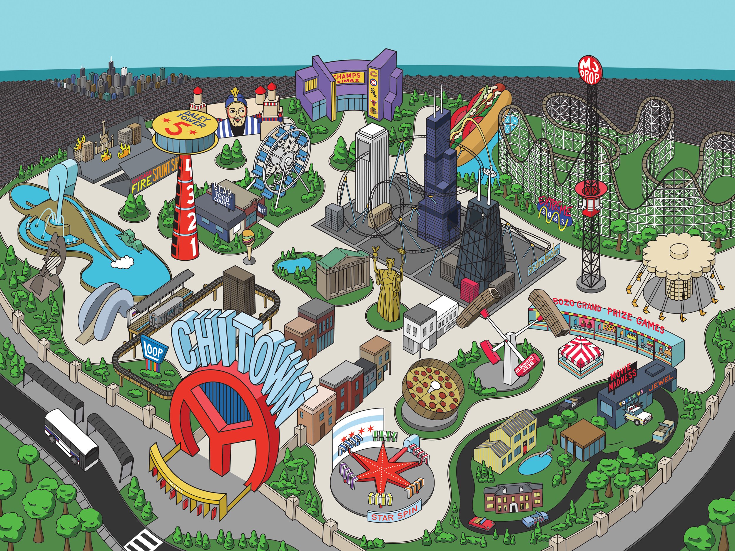
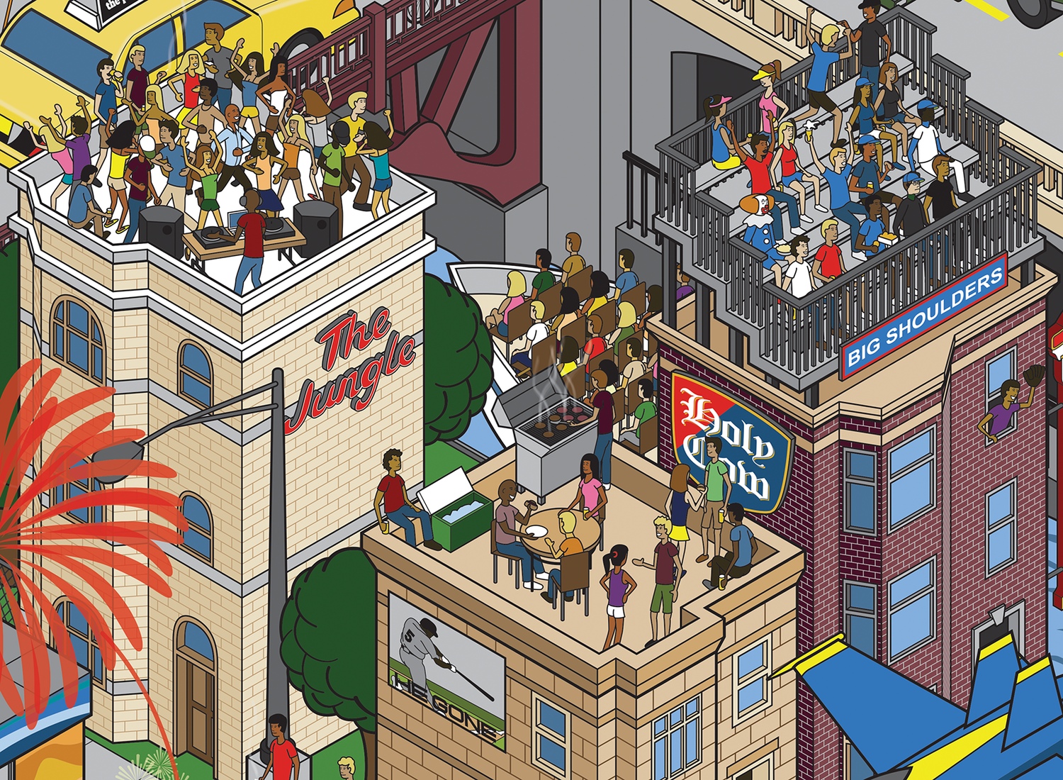
Chicago Amusement Park
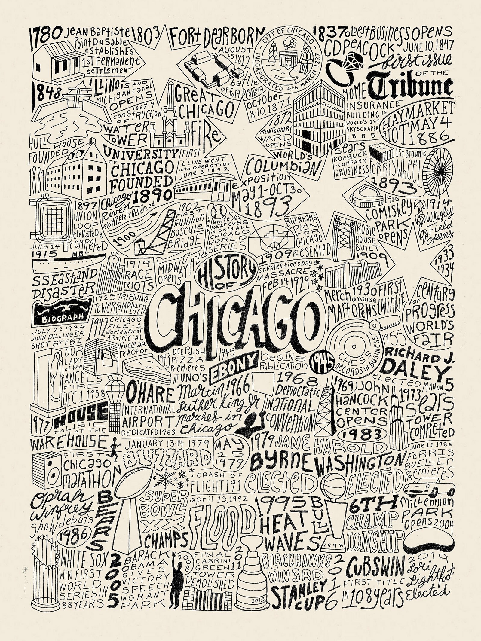
History of Chicago
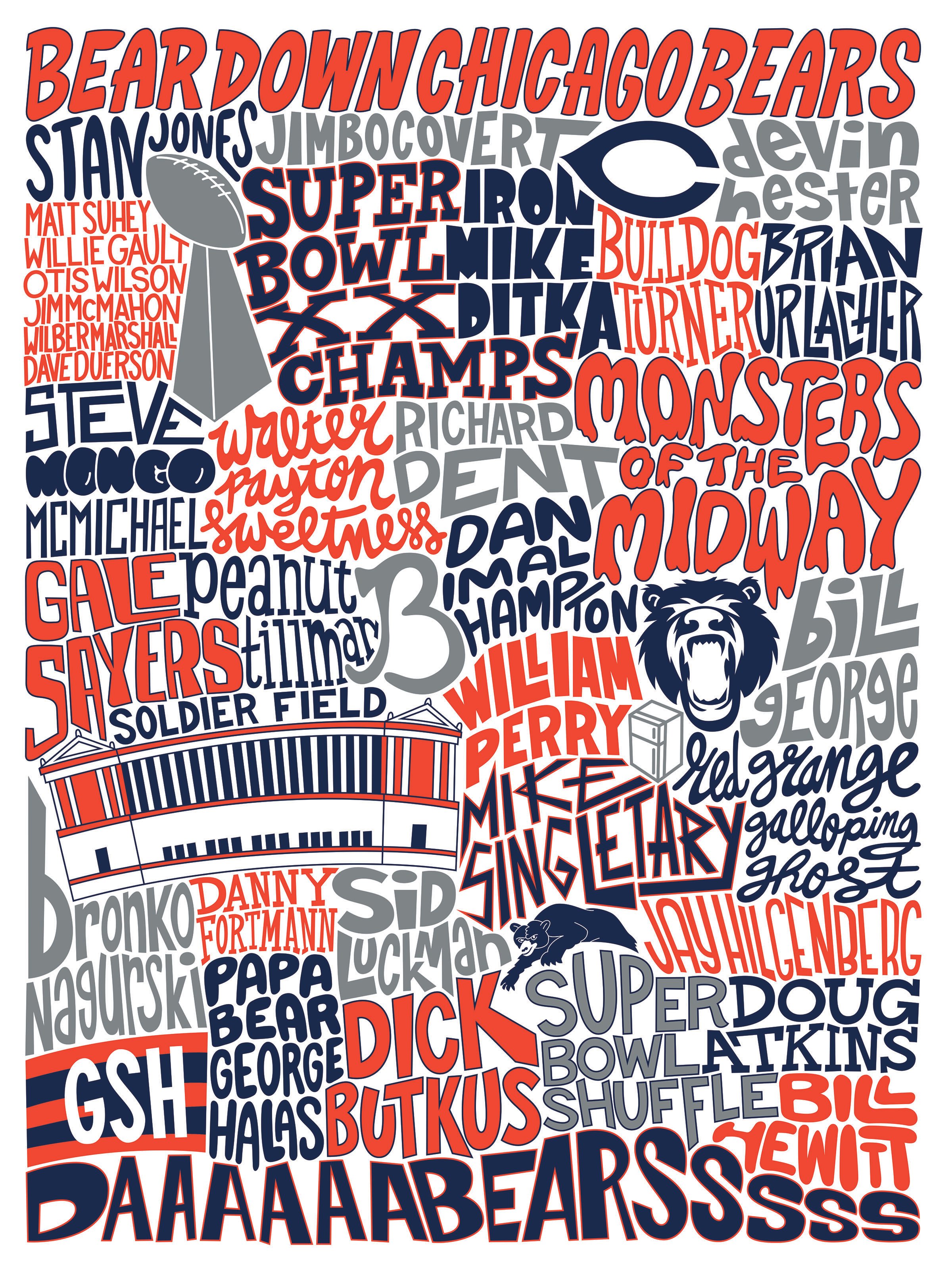
Chicago Bears
Iconic Chicago Logo
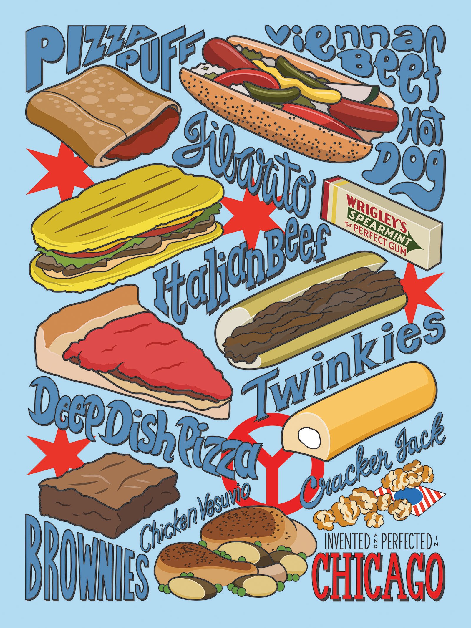
Invented in Chicago
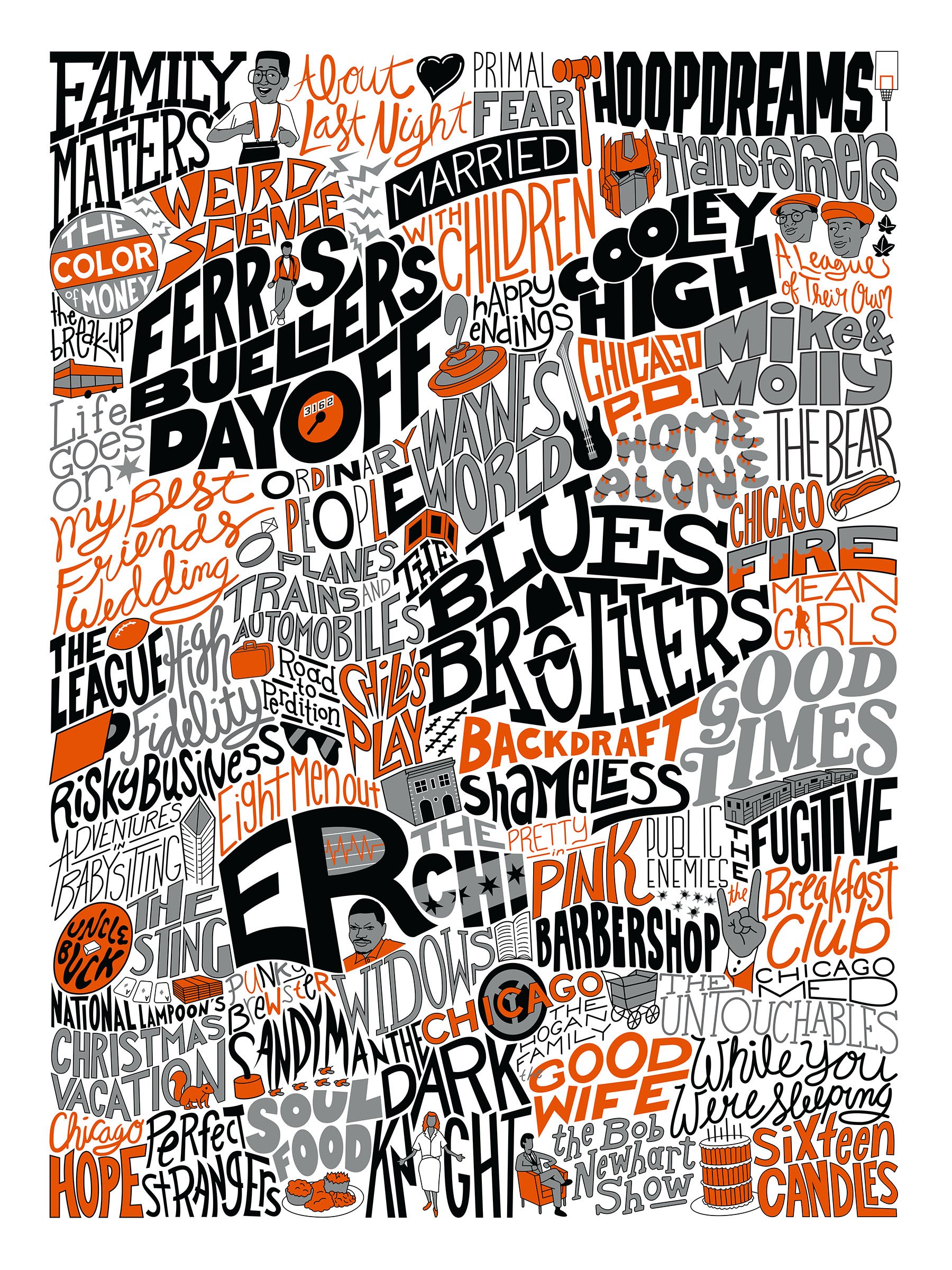
Entertainment Chicago
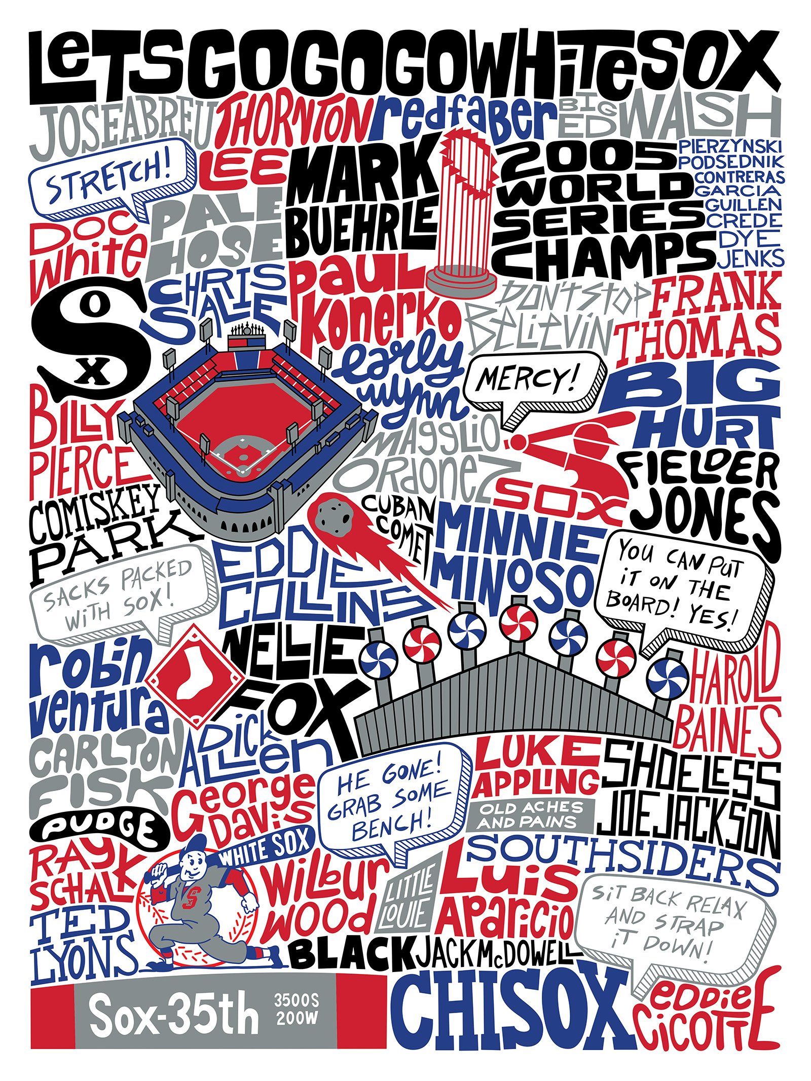
Chicago White Sox
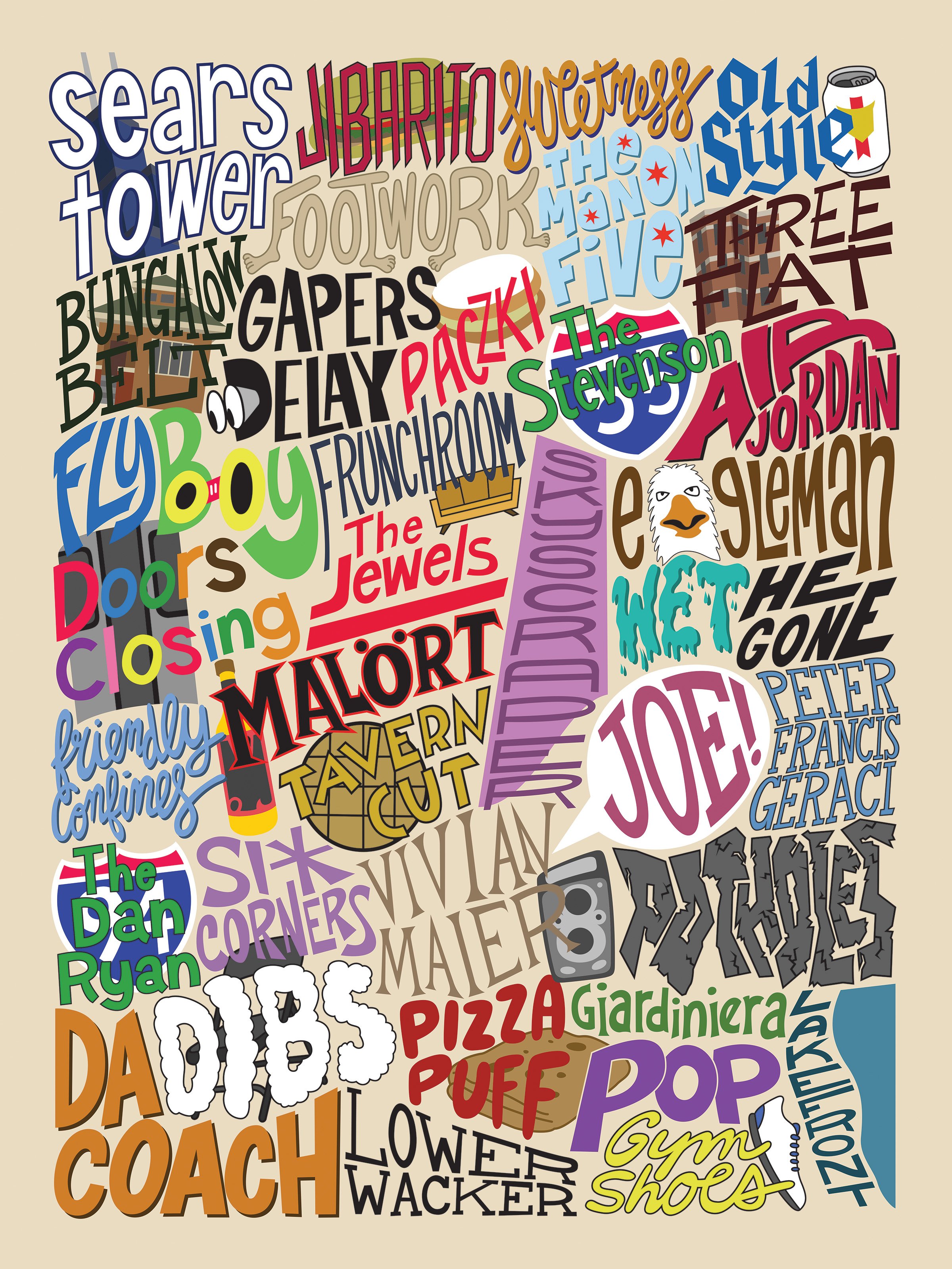
Chicago Words
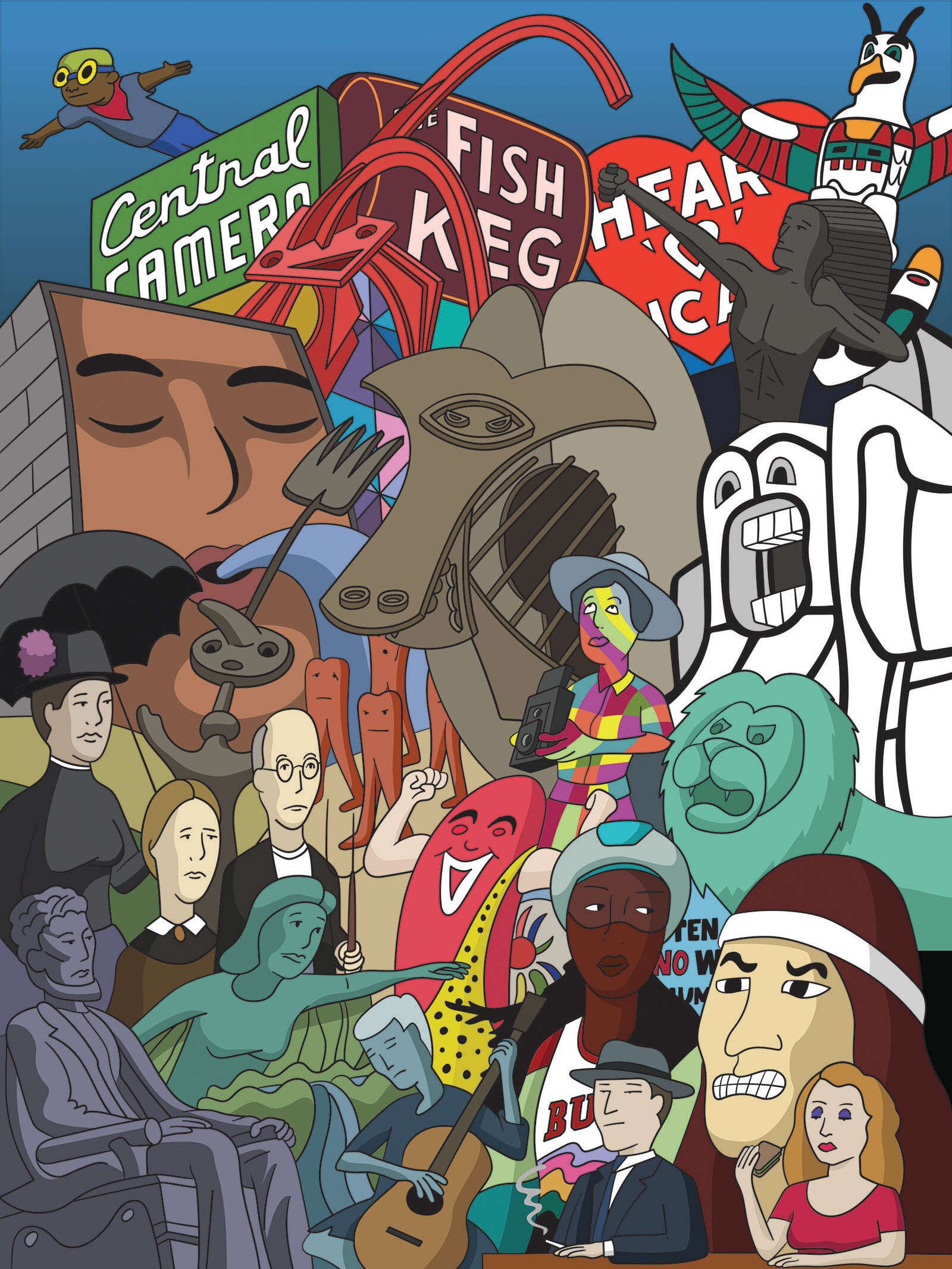
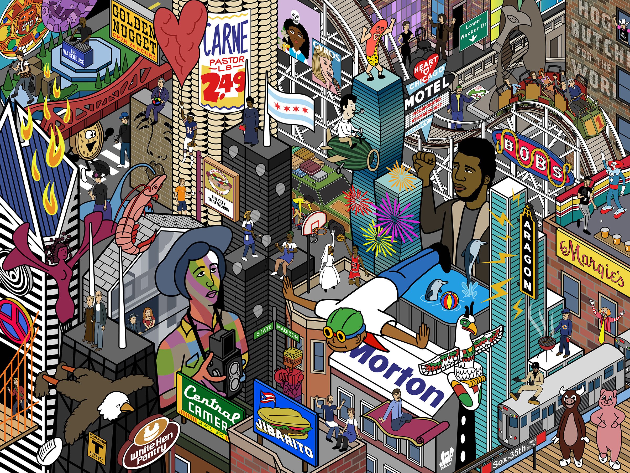
Surreal Chicago
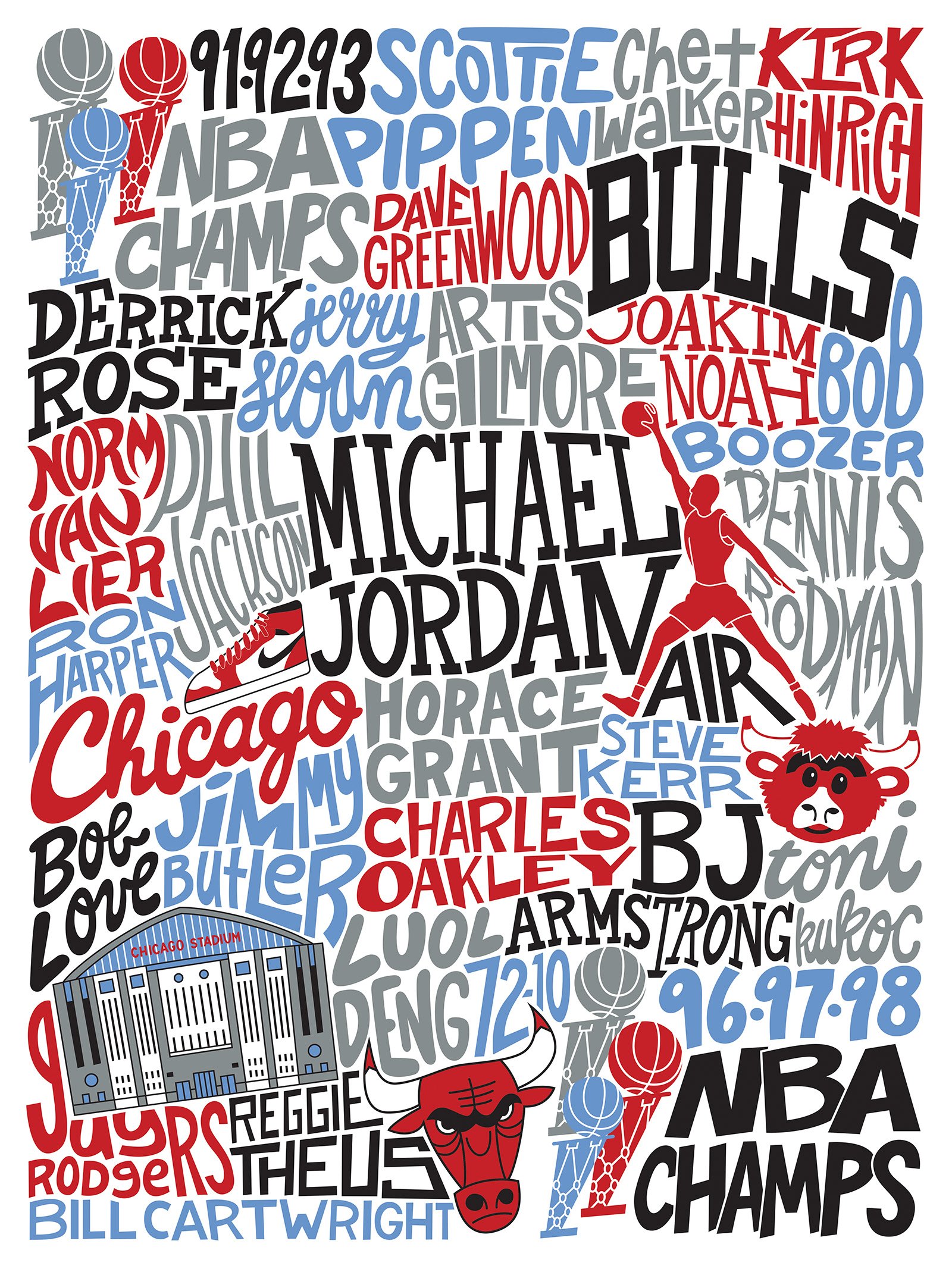
Chicago Bulls
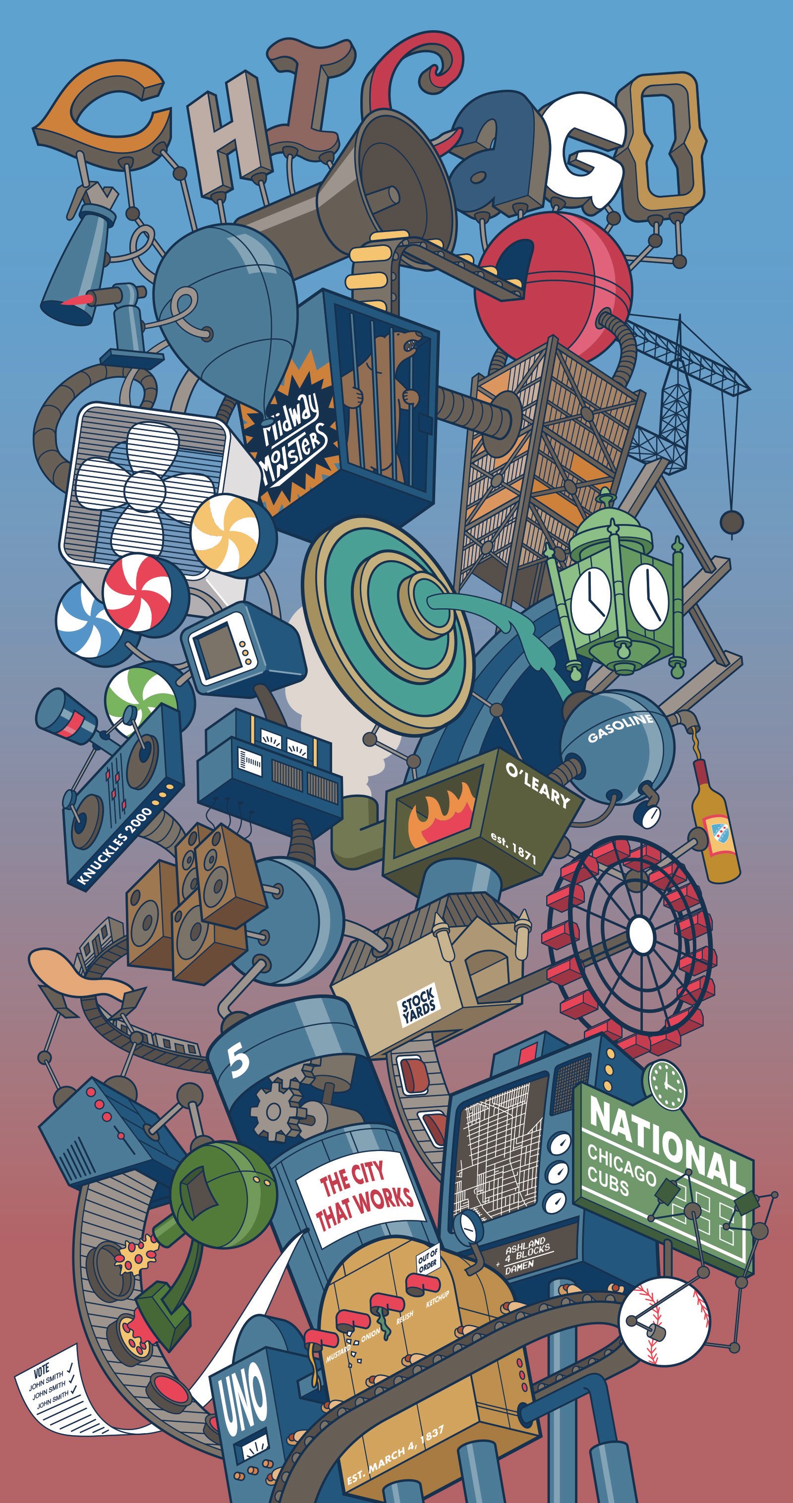
Chicago Factory
Chicago Animations
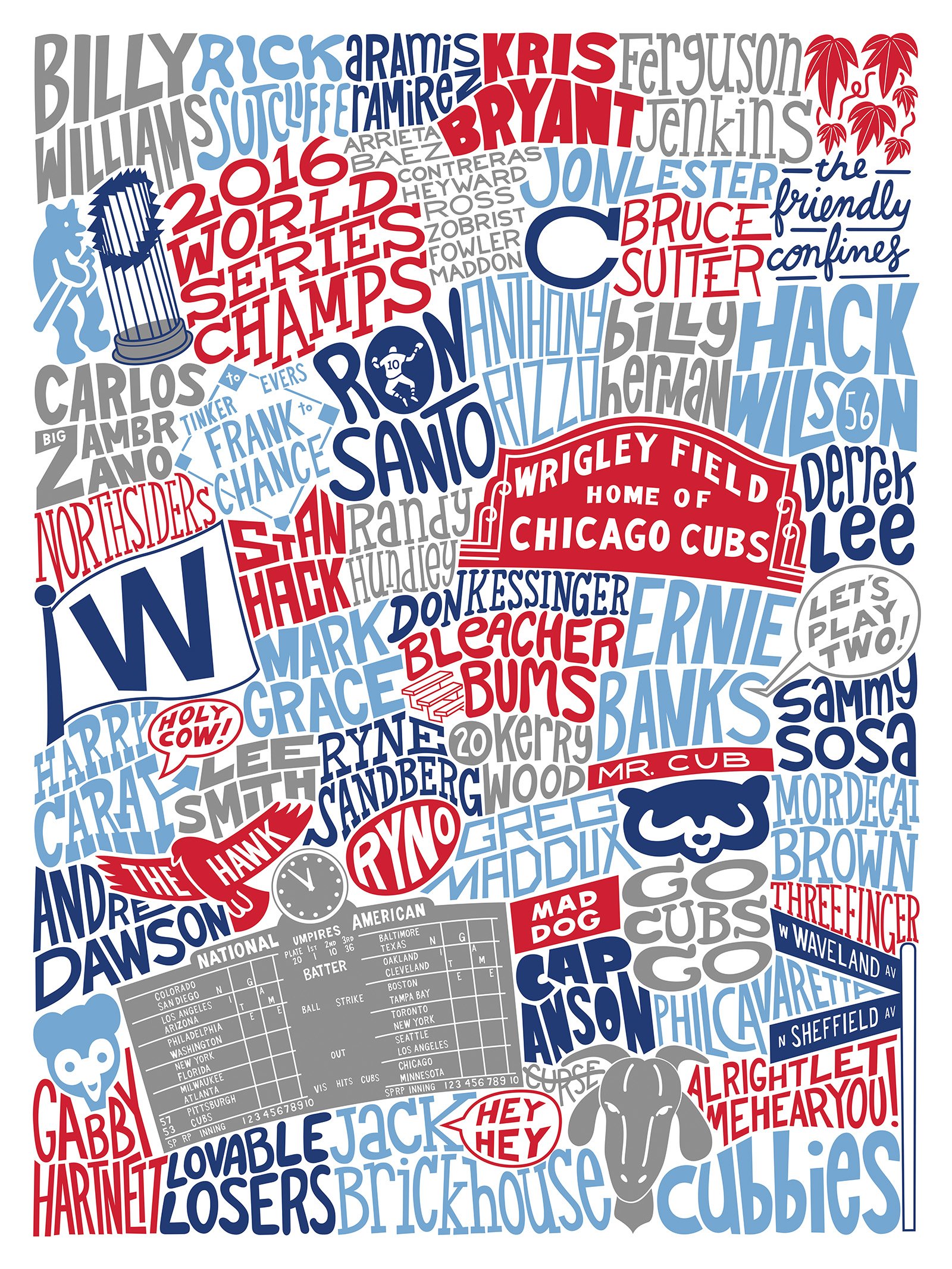
Chicago Cubs
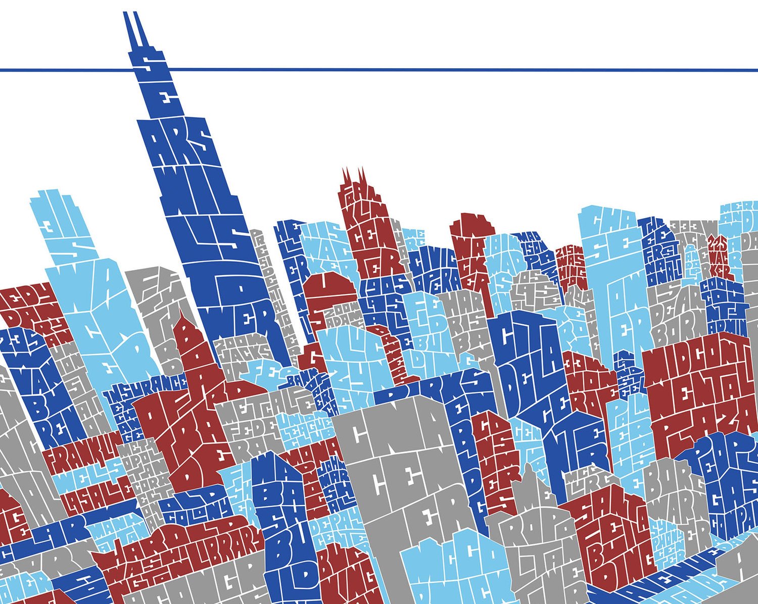
Chicago Typography Aerial Skyline
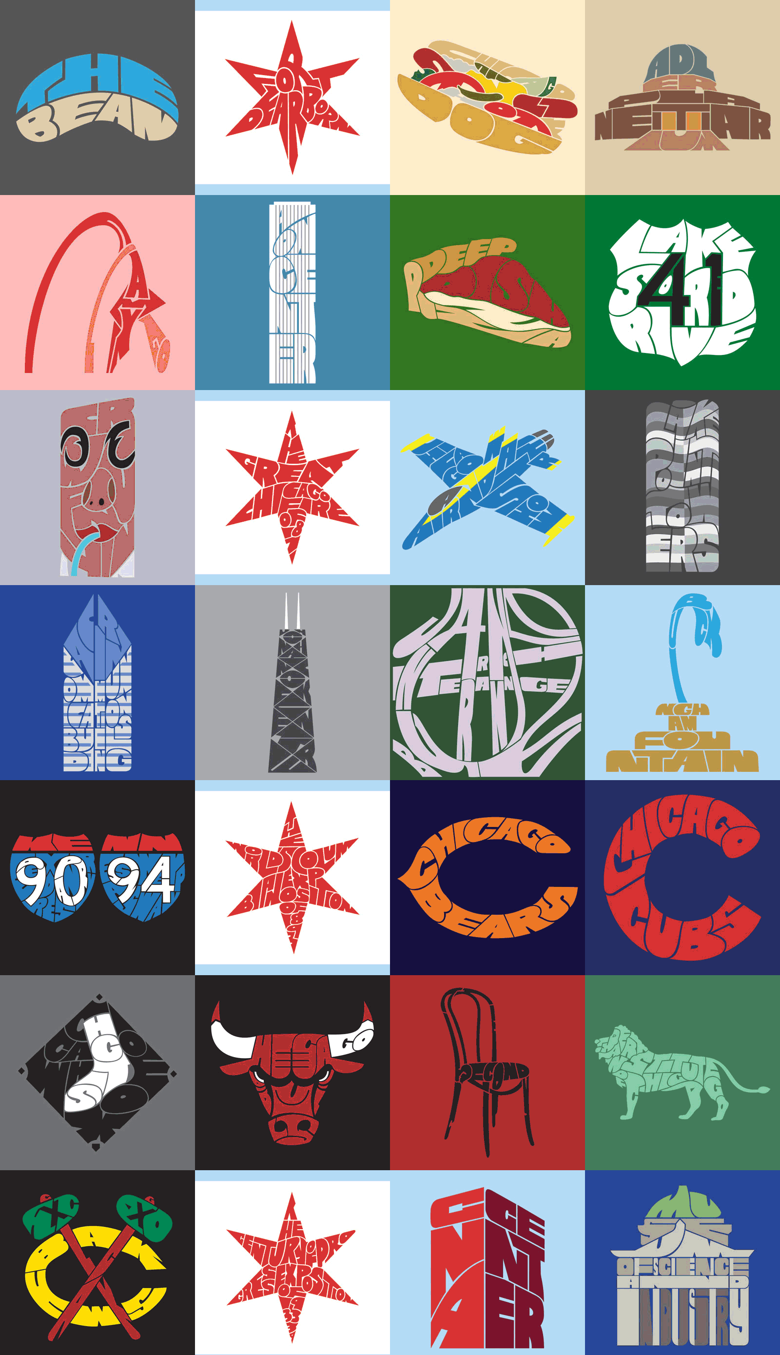
100 Days of Chicago Typography
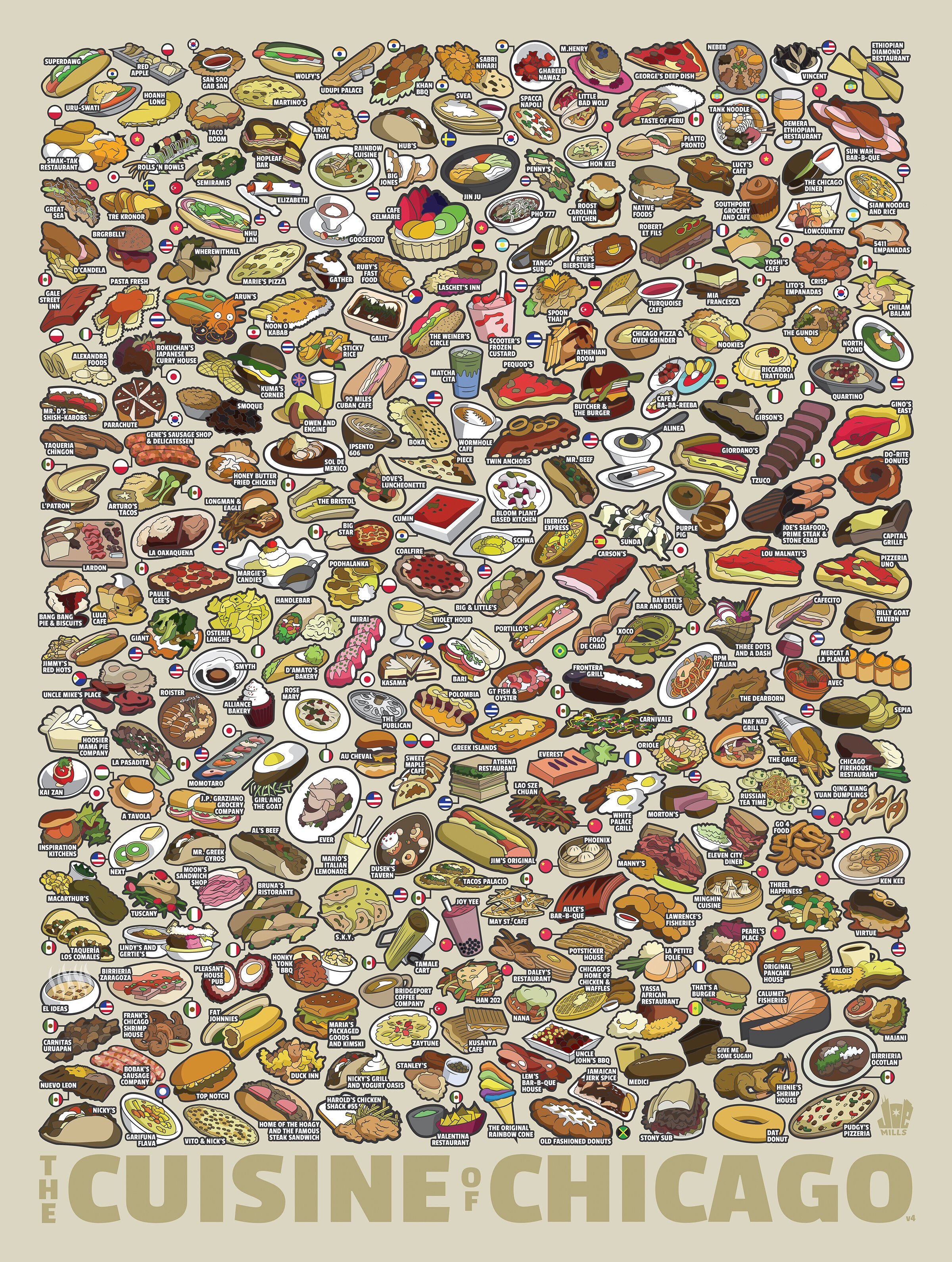
Chicago Food Map
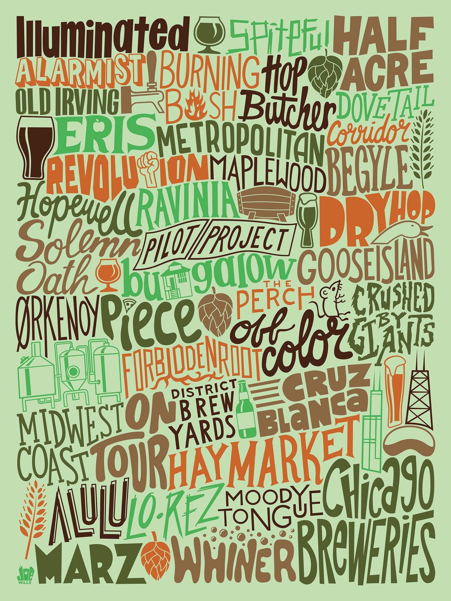
Chicago Breweries Map
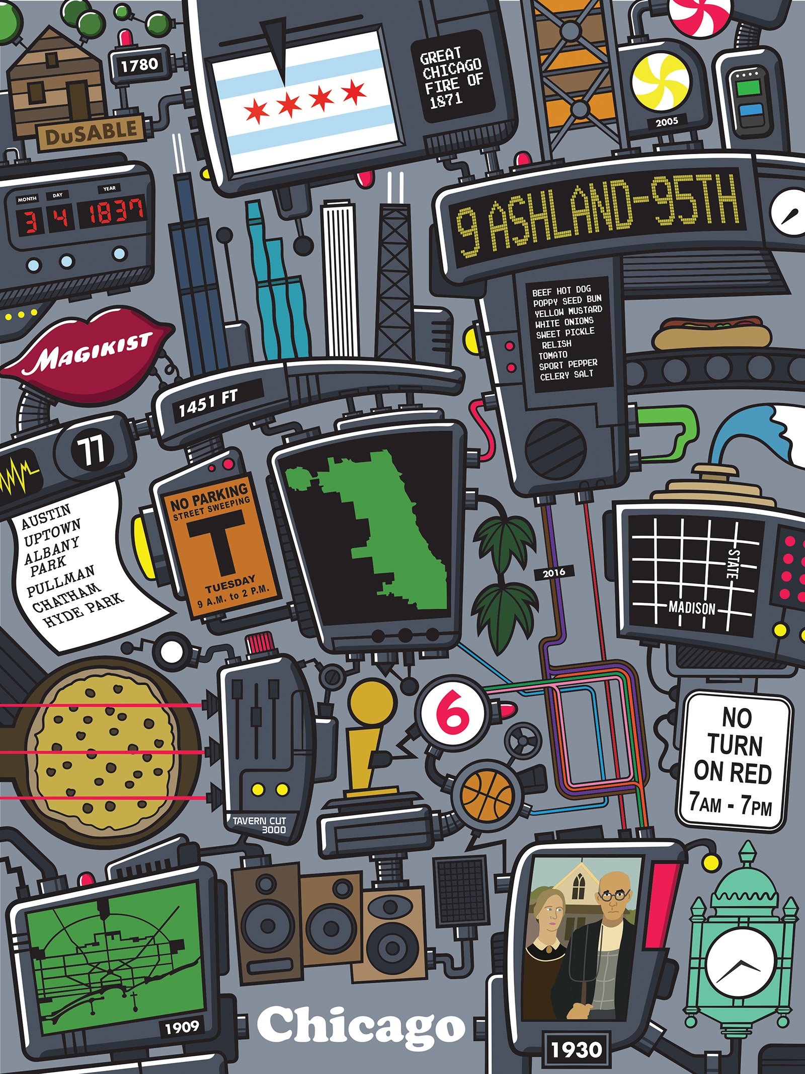
Chicago Flat Factory
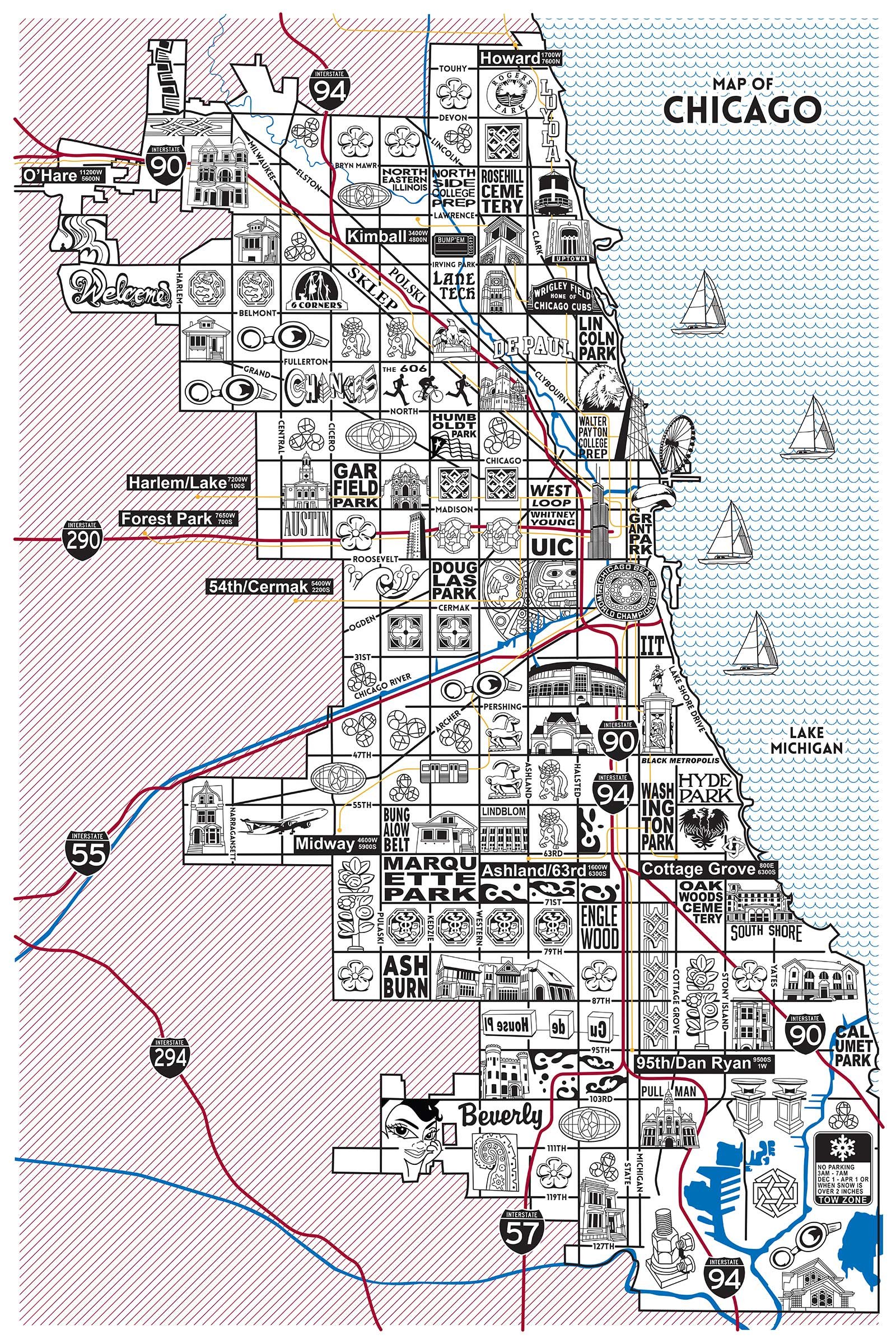
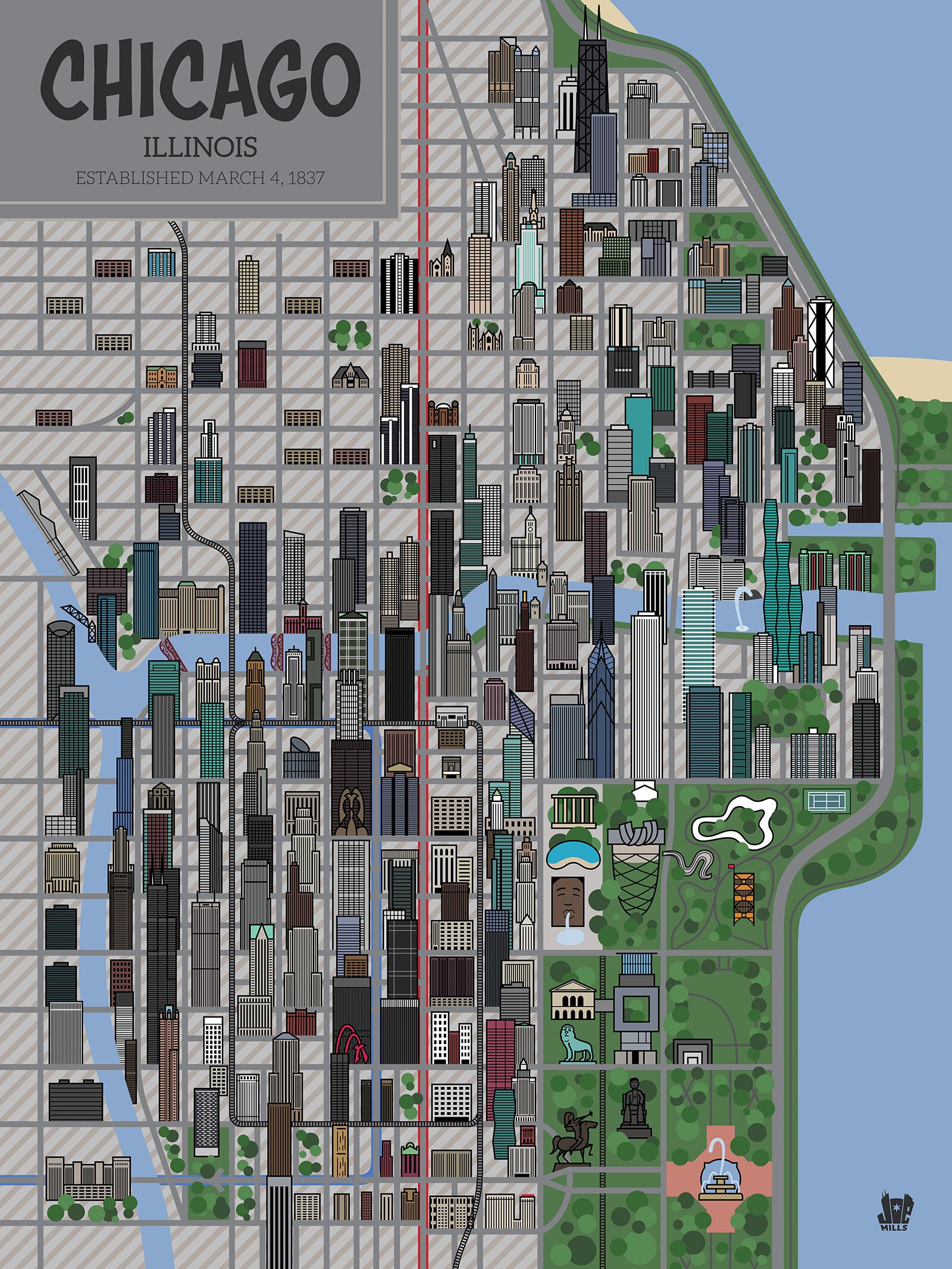
Chicago Map
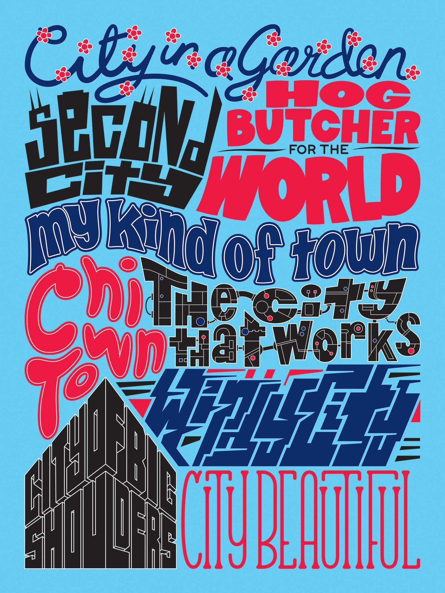
Chicago Nicknames
Every Chicago Neighborhood
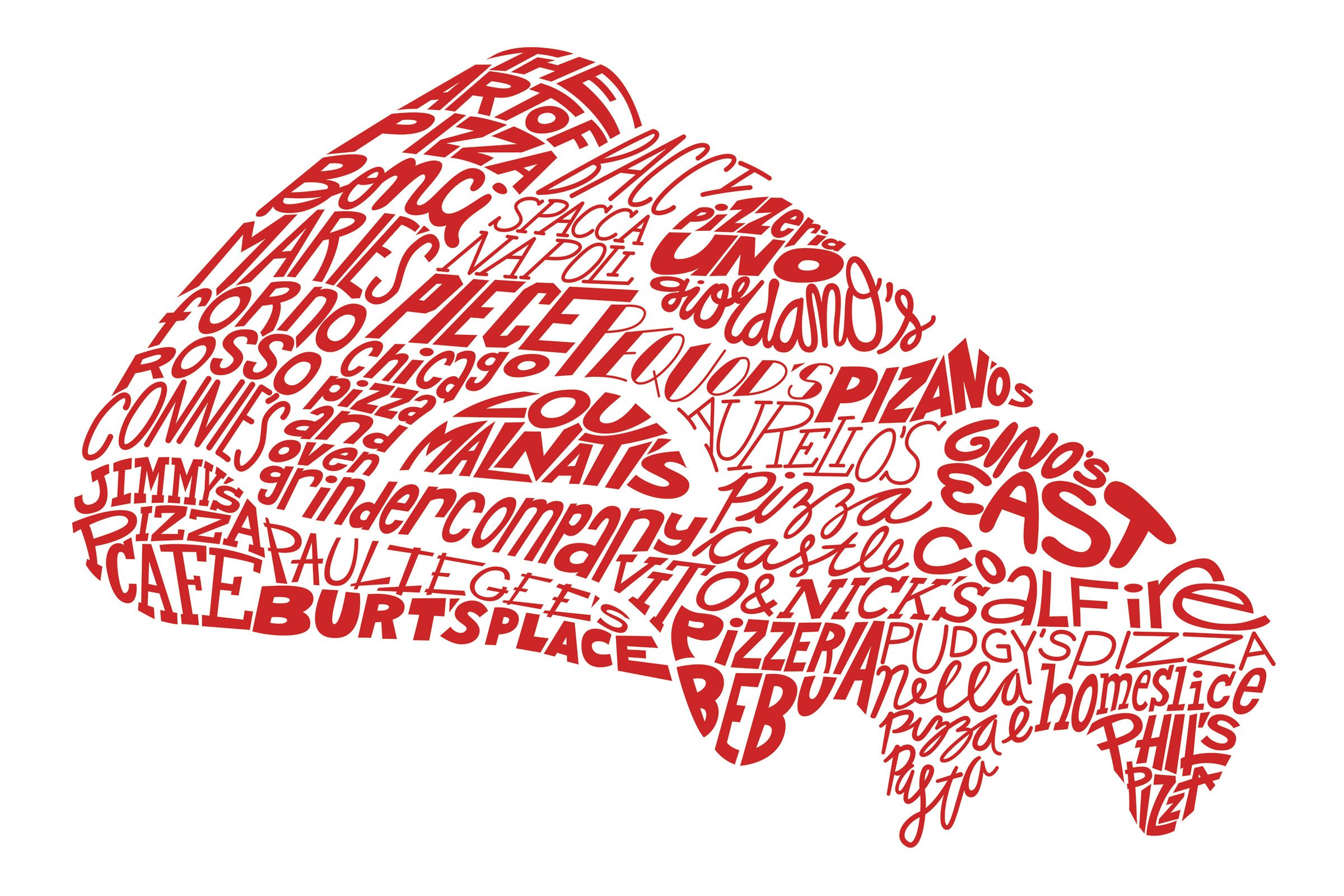
Chicago Pizzerias
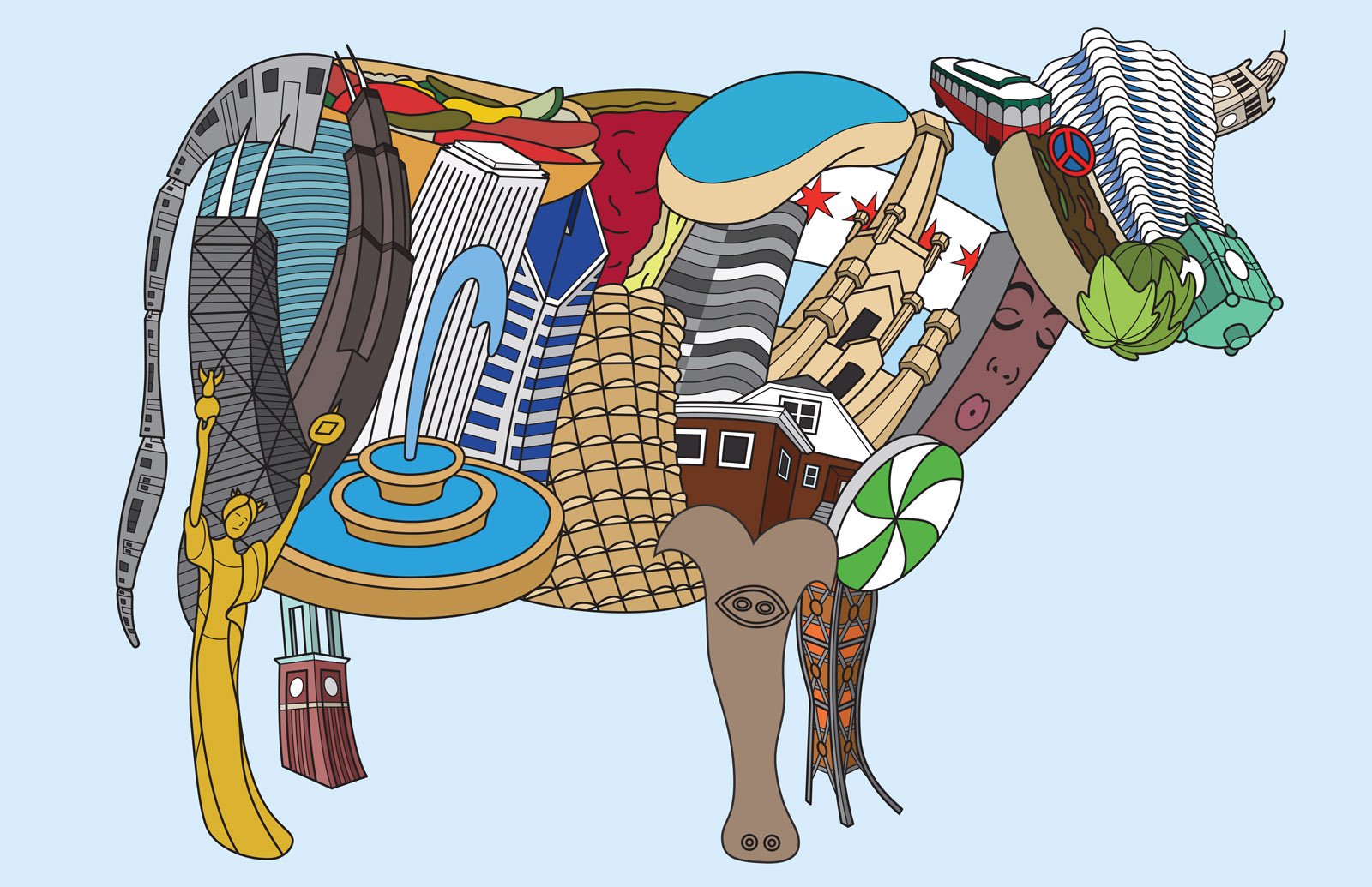
Chicago Cow
Chicago Icons
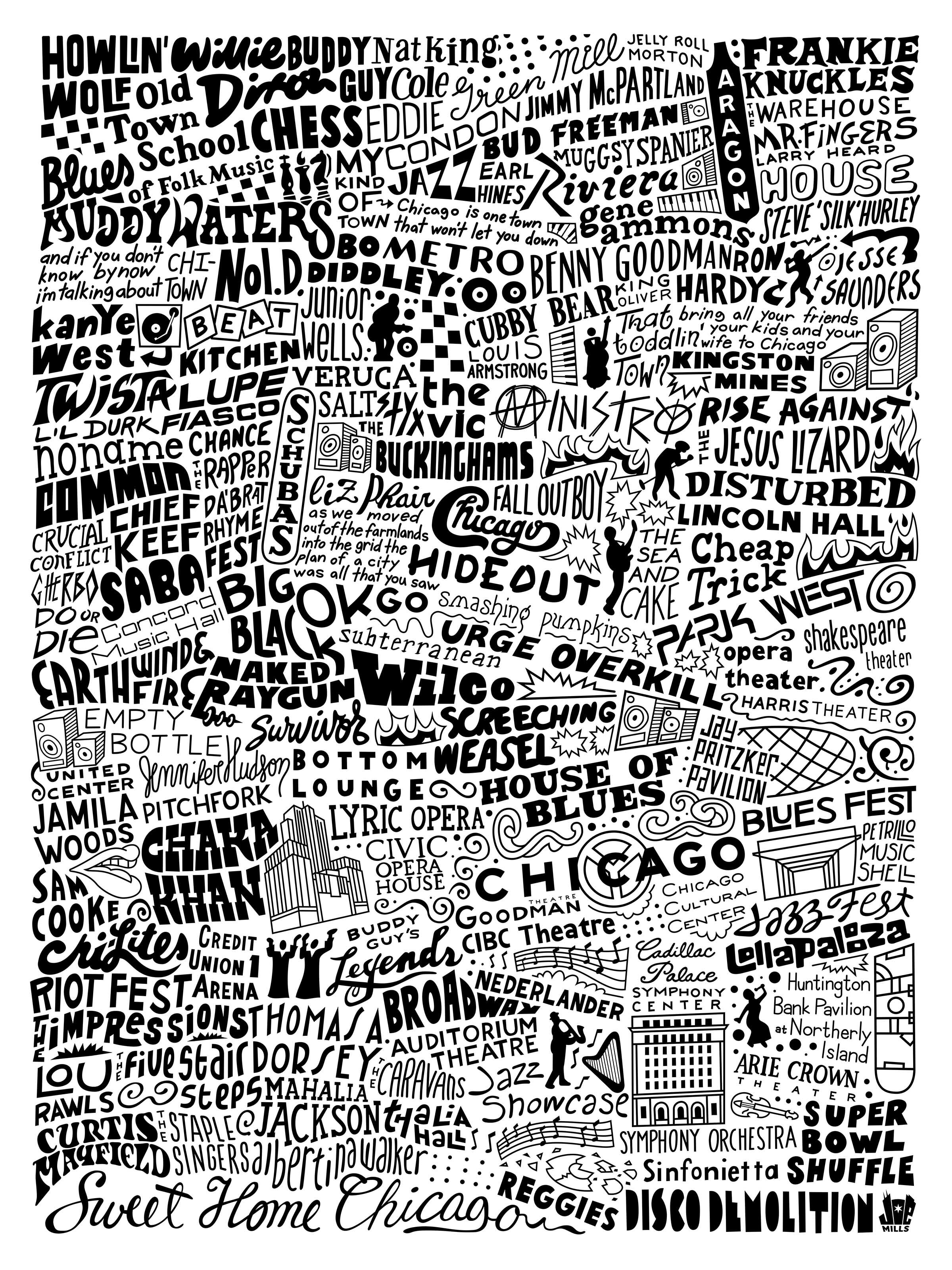
Chicago Music Map
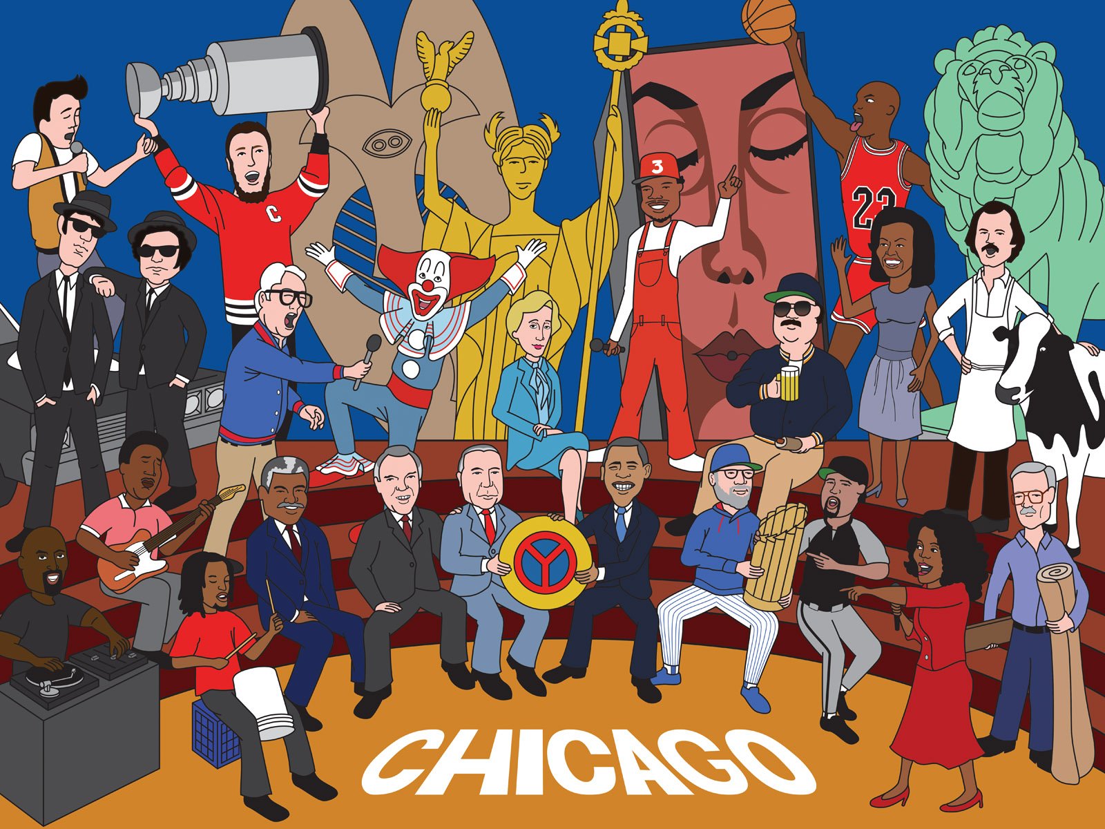
Chicago Characters
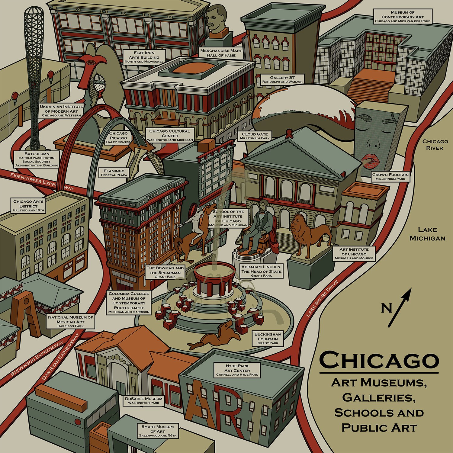
Chicago Art Museum Map
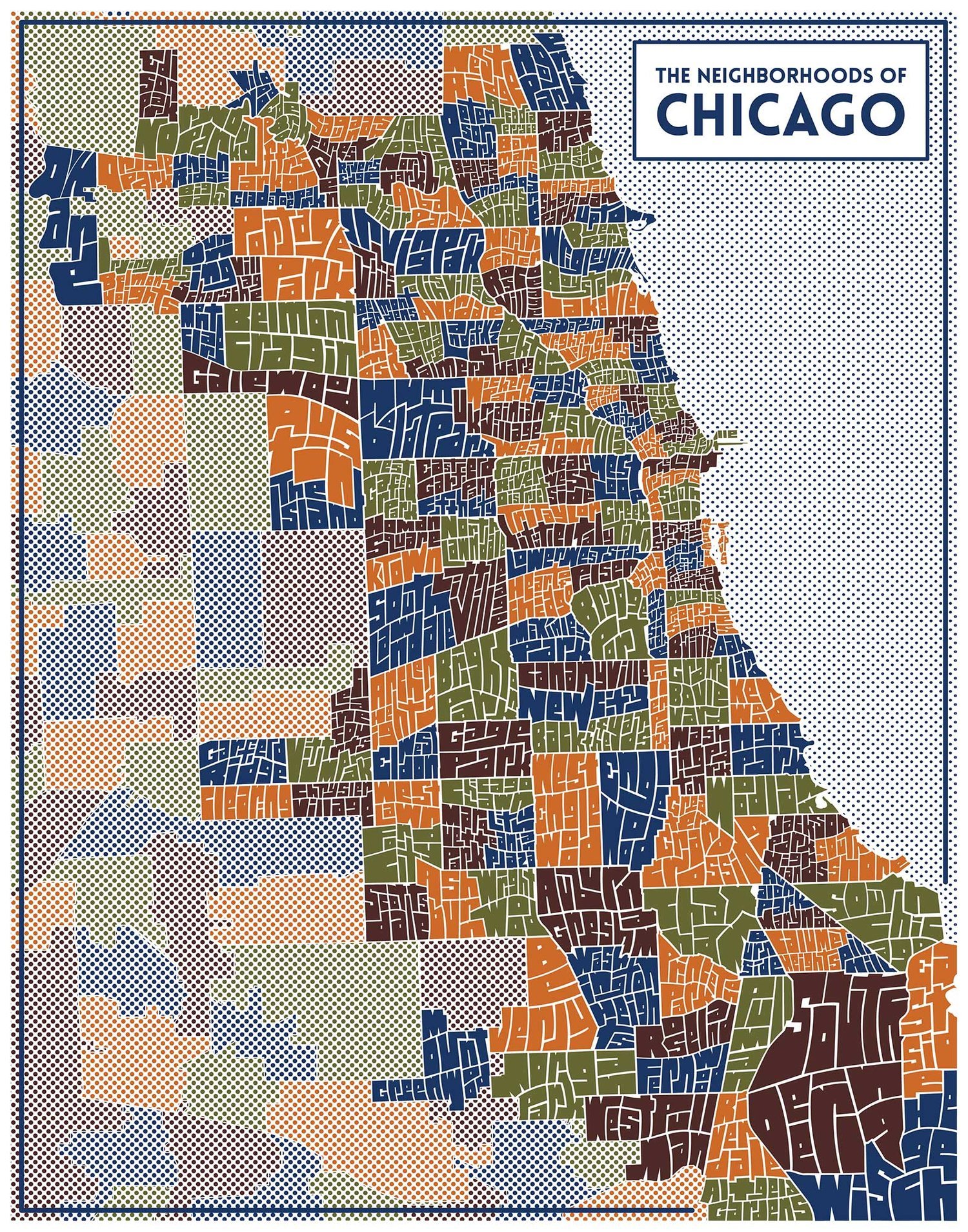
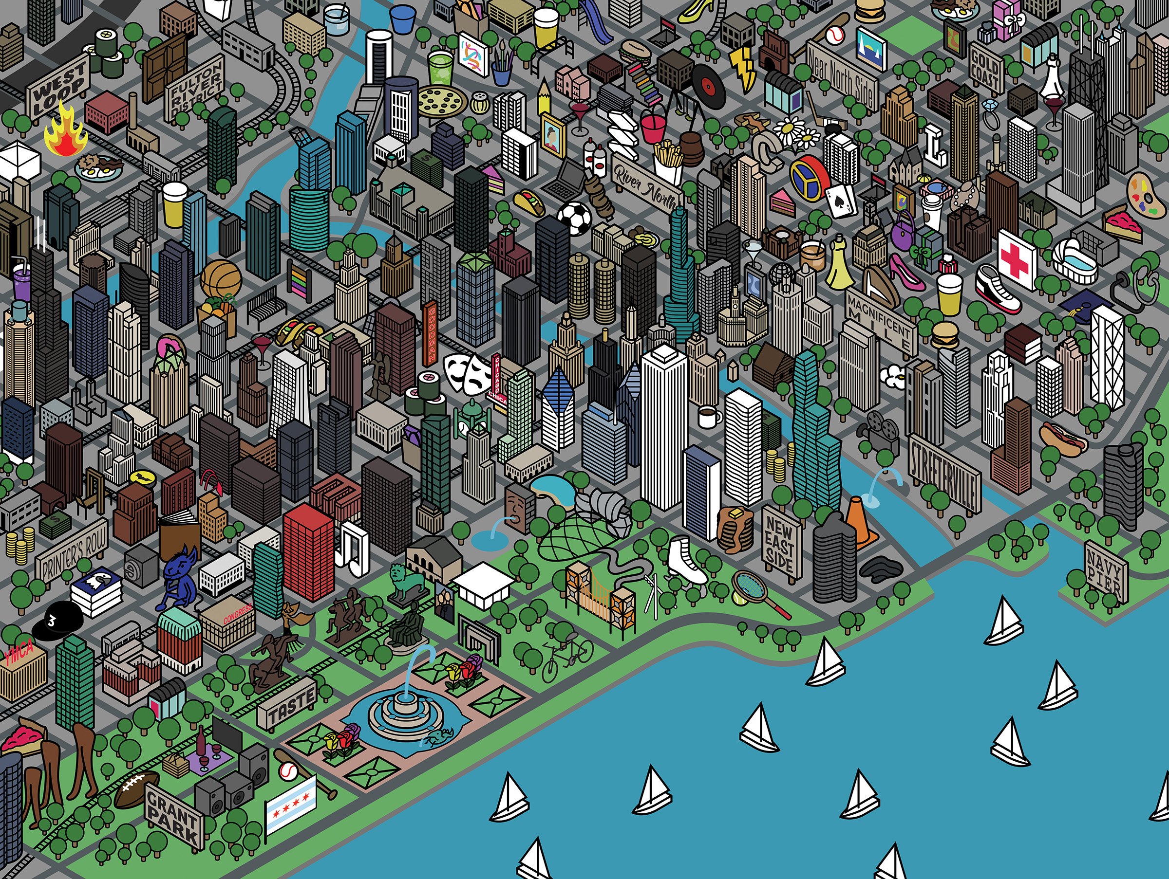
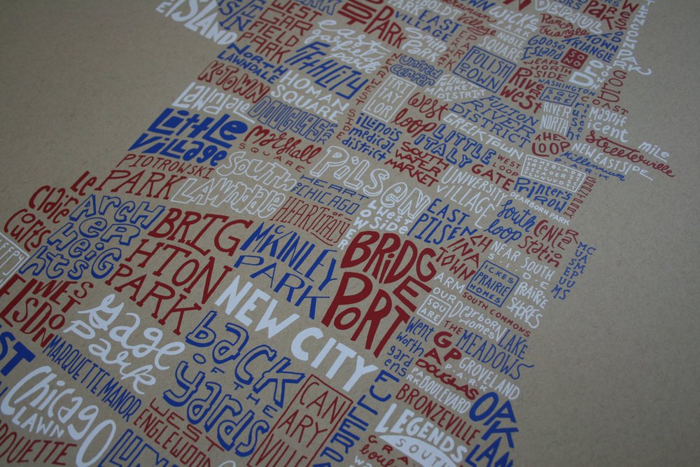
Chicago Typography Neighborhood Map
Summer in Chicago
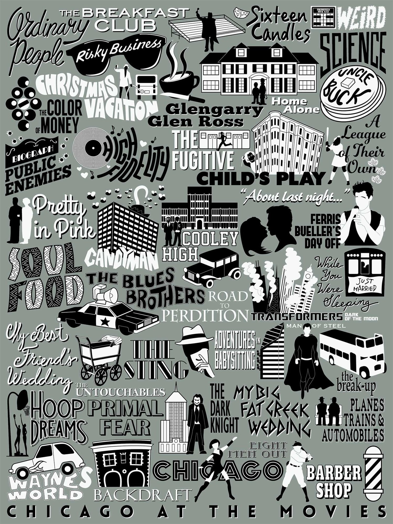
Chicago Movie Map
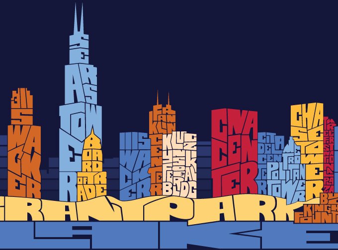
Chicago Typography Skyline