
100 Chicago icons and landmarks illustrated as calligrams. A calligram is a word or piece of text in which the design and layout of the letters creates a visual image related to the meaning of the words themselves. This project was part of The 100 Day Project.

Chicago Style Hot Dog Original Drawing

Adler Planetarium Original Drawing

Air and Water Show Original Drawing

Buckingham Fountain Original Drawing

Kennedy and Dan Ryan Expressway Original Drawing

Art Institute Original Drawing

Chicago Bulls Original Drawing

World's Columbian Exposition Original Drawing
100 Days of Chicago Typography
As a way to remember The 100 Day Project, I thought I would write about how it all came about and how I approached some of the illustrations. Even though I am constantly working on new artworks, there are always projects in the back of my mind that I hope to do one day. Maybe I don’t have a good idea yet. Maybe I’m not ready to start it yet. Or, maybe I need a reason to bring the project to life. I have always wanted to do a project that required me to produce artwork every day. When I came across The 100 Day Project, it gave me a reason to seriously consider it. I just needed an idea. It needed to be relevant to the things I was already doing. Plus, it needed to be possible. So, I gave it a few days of thought and decided to do calligrams for Chicago icons and landmarks. Here was my test:


After seeing it was possible, I was ready to go. Two things…I did call this 100 Days of Chicago Typography mainly because typography is a word I believe many people have at least heard. Even though, technically, these are calligrams. A calligram is a word or piece of text in which the design and layout of the letters creates a visual image related to the meaning of the words themselves. Secondly, I did not actually do all of these one day at a time. With my schedule and work flow, I knew that would be challenging. So while I didn’t produce a single piece every day, I still knew that the spirit of the project remained intact.
I realized early on that I could not approach every Chicago icon the same way. Since the number of letters and the shape of the object would greatly determine what I could do, I was fine with solving each design problem differently if needed. Let me explain further:

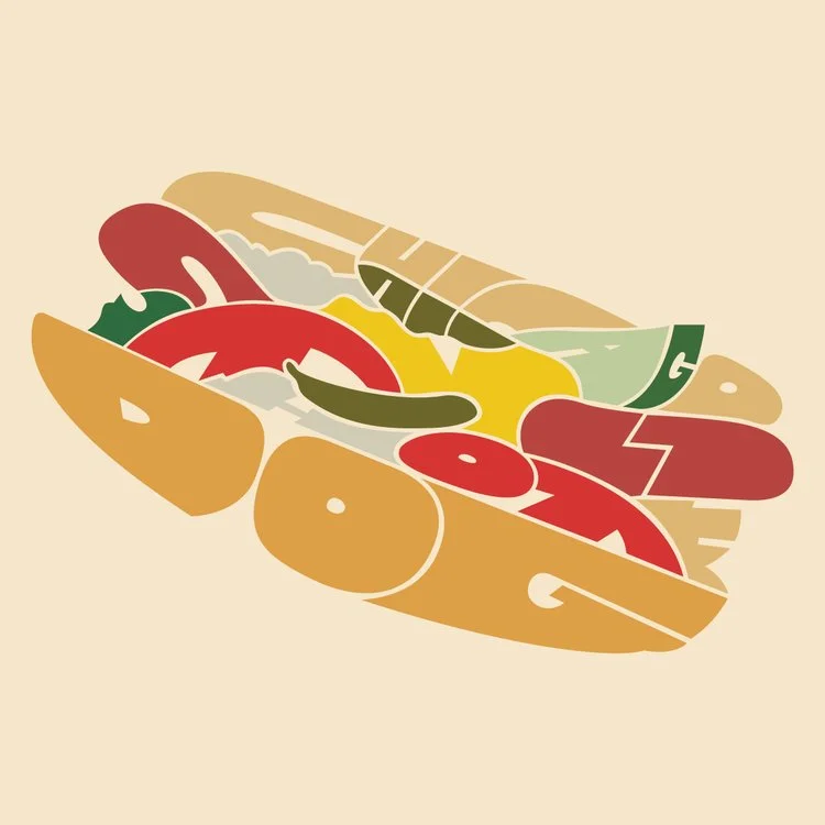
The calligram for Deep Dish Pizza was very straightforward. The pizza did not need a lot of detail and there were plenty of letters to work with. For the Chicago Style Hot Dog, it was a bit trickier. The different colored elements and non-uniform object required a different approach. As you will see, a few of the letters include two different colors. It was not a method I wanted to do much. However, making the object look as accurate as possible was just as important as using all the letters correctly. This was especially important since I did a lot of buildings.
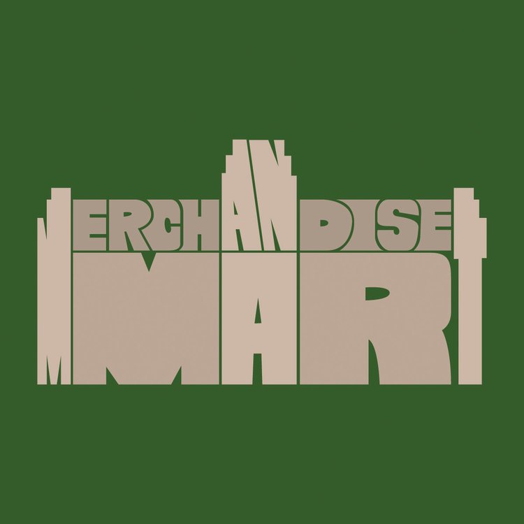

With buildings, I always considered when to include and not include certain architectural elements. For the Merchandise Mart, I originally thought I was going to need to show the windows. After completing the illustration as you see it now, it was apparent I did not need to do that. What I had was enough. For the Aon Center, however, I added the tall vertical lines since that is such an important part of the look. In general, I prefer the look of the calligrams like the Merchandise Mart. However, adding more details was unavoidable in certain cases.


A few times I used the letters to create some of the architectural details of the buildings. There were times I used the letters to create the windows. Or, as in the case of Aqua, create the waves in the building. I was particularly pleased with the Aqua calligram because it is one of my favorite buildings in Chicago and I knew it would be a challenge to illustrate because it only has 4 letters. For the Ferris Wheel, I used the negative space of the Ferris Wheel to create the letters. I figured illustrating it using the positive space would be too much and potentially take away from the overall look.


Finally, sometimes I had to just try something totally different. For Lake Michigan, I thought it would be a bit boring to do a calligram of the outline of the lake. To get around that, I used an object that is heavily connected to the lake…a sailboat. I tried this same approach when doing North Avenue Beach and the Lakefront Trail. For the Chicago Two-Flat, I completely threw out the book. I knew the amount of letters and the architecture of the two-flat would not work out. So, I made it work as best as I could. Some of the letters take on multiple colors and elements of the two-flat. And while I would normally do the windows the same throughout, I sometimes made them holes in letters. Or, I made them part of the letter like I did with the I and T.